I find that there is a relatively unused feature of the Edit Payables Check Batch window. You have the option to change which columns appear on each side of the window. One change I nearly always make is to display the document number instead of the voucher number. Voucher number, really, what’s up with that?
Not only can you turn on or off the columns, you can also rearrange them.
In the screenshot below, notice I changed the left-hand section to include the Payment Priority. On the right-hand side, I changed Voucher Number to Document Number and added a field for the Original Amount.
To make these changes, you just need to push the ‘Column’ button in the header of the side you want to change. The button is circled in red above.
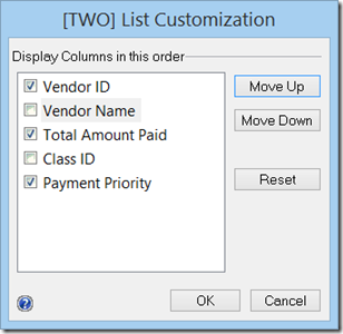
Upon pushing the button on the left, you get the following window with some additional choices that you can turn on or off. You are limited; you can only choose to display three columns. It will bark at you if you select too many.
Pushing the button on the right, will reward you with the following window with some additional choices that you can turn on or off. You are limited to seven columns for the right side. This side will bark at you too if you select too many.
Choices for the left and right are listed in the table below:
| Left Side | Right Side |
| Vendor ID | Voucher Number |
| Vendor Name | Document Number |
| Total Amount Paid | Due Date |
| Class ID | Amount Remaining |
| Payment Priority | Amount Paid |
| Original Amount | |
| Discount Date | |
| Terms Available | |
| Terms Taken | |
| Type | |
| Transaction Description | |
| Currency ID |
Utilizing this feature can make this popular window even more inviting.
Now, if we only had a way to ‘Unmark All’. The suggestion is on Connect. Vote for 921336 if you agree.
Kind regards,
Leslie


2 comments:
Is there a way to add more columns to that list of options?
Hi,
Unfortunately, there is no option available to modify the choices on the lists.
Leslie
Post a Comment