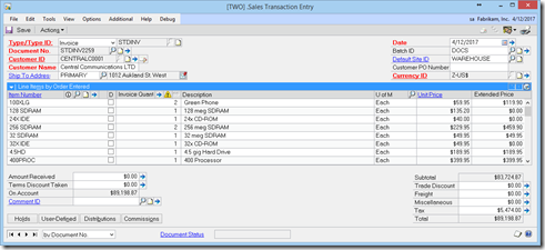
The SOP Entry window pictured above has been modified to bring the Description up to the first line. This made the window quite wide, but my goal was to get as much of the description visible as possible. The expanded view looks almost the same as the original, except I added the Item Code field as can be seen below:
If you would like a copy of this modified window for yourself, you can download the package file containing this window here: https://app.box.com/s/z2sujz9pu62jbybhxb4b
This is a GP2013 R2 window.
I welcome any suggestions you all may have to spiffy this up.
Until next post,
Leslie


No comments:
Post a Comment